The brief :
Student were asked to design a new logo for a choosen club/national team, etc... in a sport of their own choice. However, the logo must be related to the choosen Greek God choosen and given to him/her since the begining of the semester. The choosen Greek Mythological God here will be Athena the Goddess of War.
The concept :
As shown previously, ( scroll down ), 3 concepts were designed/drawn from the related Mythological Greek God, Athena. The sport choosen is Baseball.
The team is a young and dinamic team. As every Baseball team, there will be two different types of logo. A main one, and an alternate one, ( normally the alternate logos are used on the playground's banners, T-shirts, caps or baseball helmets, where the main logo is too large to fit to the designated area, and will lose its definition and details if minimised.
Athena reflects strength and respect, as she is the Goddess of War, therefore the appearence of the logo should be strong, feared and respected one. Similarly to Basketballs teams, members of the Baseballs teams are very loyal and are proud of their belongings to their actual teams as they wore very proudly their team colours and team logos.
The logos :
All the logos underneath are linked to whether the sport choosen ( Baseball ), or something linked to the Greek Mythology. The colours used are very typical in the discipline, Red, Black together with Grey, or Blue, Red together with White. One of the concept is also in Violet,Red and white. However the final choosen one is in Red, Black and has a shadow of Prussian Blue.
Concept one :

Captain Shiner is the font used with the letter "A" for Athenians, and the word "Warriors", from the same typeface, to describe the ferocity and fighting spirit of the team, drawn on a Baseball ball on its background. This logo straight at the first sight describe th
e sport the team is specialised in.
The colours used is white, as the ball is white generally, Red or the ball's strings, and Blue for the team colour. Together the three coulour will be the choosen coulurs of the team.
Concept two :

Concept two is drawn also with the Captain Shiner font, but this
time is coloured in violet, outlined by black. A ba
ckground image representing is a fallen/broken anciant Greek pole/pillar, forms part of the design. White is finally the background colour. All together the three coulours will be the final choosen colours for this concept.
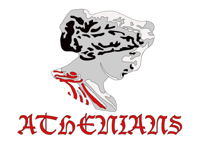
Concept three :

The third concept is derived from a combinason of the font Lucida Blackletter, with a section/ lower part of a broken Greek pillar/pole. Eccentric Std font also is added at th
e bottom of the designed logo, with the word "Athenians" to describe the name of the team. The colours used here is Red, Black and Grey.


Concept four:
Concept four is the final choosen one among the four design concepts. However a fifth one ( underneath it ) will be the alternate logo for the team. The "A" derived from the third concept will influence the designer to incorporate it within the final smaller/alternate one. However the whole letter " ATHENIANS" will be removed as only the sight of the letter "A" is enough to understand the meaning. Both final concepts are reworked on illustrator. The colours used are, Red, Black, and Grey on White background.

No comments:
Post a Comment